
Serjella Olive Oil
BRANDING
Serjella is a leading Syrian olive oil produced by a family company based in the agricultural city of Hama. The name originates from the ancient city of Serjella, renowned for its olive oil production 1,500 years ago. Guided by family values and passion for olive oil, Serjella has become a reference for Syrian olive oil both locally and regionally.
Team
Hi-Do Team
Year
2018
Categories
Packaging
Branding
Photography
Marketing


Creative Process
The brand ‘Serjella’ represents mainly olive oil which is considered a very important middle eastern cuisine element , yet it is always considered challenging to bring out a certain cuisine element to succeed as a worldwide product, the process was separated into main milestones are the following :
Branding
The branding phase was by presenting main concepts followed by completing the brand elements of colour system , patterns , Guidelines & Typography.
Web Design
Serjella website design was tailored to be suitable for both foreign and arab community as a gallery which shows the products of SERJELLA and an introductory to middle eastern cuisine by showing various dishes and Elements of it.
Packaging Design
The packaging of Serjella products was mainly based on Designing am oil packaging bottles and cans which fits the brand vision and purpose.
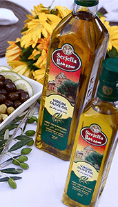
Product Photography
The photography of serjella products was one of the most successful phases by It’s results and purpose , it was based around the uses of the product in its origin , along with the middle eastern cuisine dishes with a Professional minimal advertising photography.
Branding headlines
The goals of the creative process of Serjella branding was set to be successful for the longest period possible , and to be suitable for everyone as a worldwide product, that was available by setting some main headlines to consider, which are represented as :
Minimal Design
Original Packaging
Creative Ideas


an Artsitic Side
Iconography
One of the interesting sides of the elements of Serjella is the icons design , the iconography philosophy was set to be comprehensible in such an artistic-based method.
Negative Space
The use of negative space was essential due to its role in improving both of the artistic and functional side of the brand , reflecting the vision , mission and ambition briefed by the client.
an original touch
Packaging Tags
The design of Serjella Packaging tags was set to be a major part of introducing and preserving the history and heritage behind the name of Serjella which represents the historian old city of serjella.


Logistic Distribution System
Hi-Do team accompanied by the the team of Serjella , was able to make a logistic marketing-based distribution system to make the products more available in the European region , tracking the distribution lanes , and making sure and development and distribution process of the product is done properly.
Resulting a sensational increase of order and profit on all the products available by the group of Serjella.
Other Works for SERJELLA
Product photography

Social media

Marketing STRATEGY
Have a Project in Mind?
Whether you are willing to take your business to the top , or to deliver your ideas in the best image , we are gladly willing to be a part of your success journey , time is precious, don’t hesitate contacting us .